asia 1

asia 5

asia 10

asia 9

asia 6

asia 8

asia 3

asia 4

asia 2

asia 11

asia 7

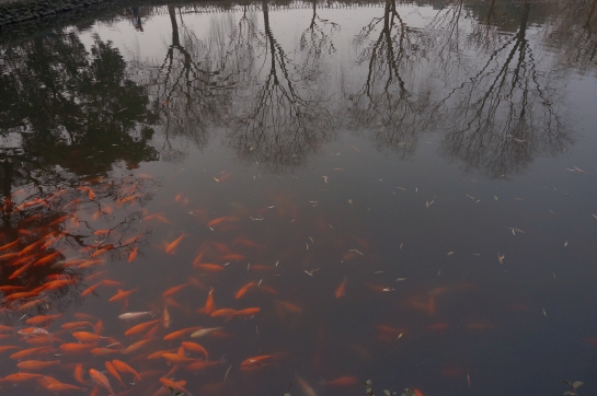
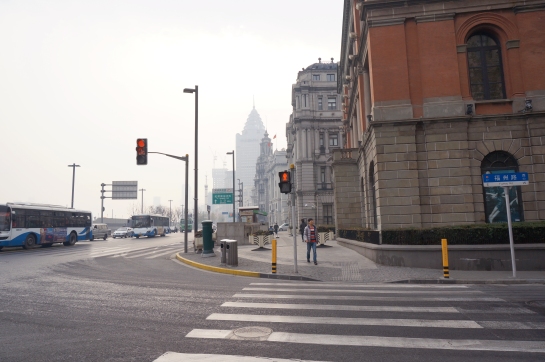
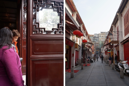
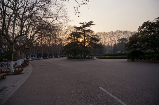
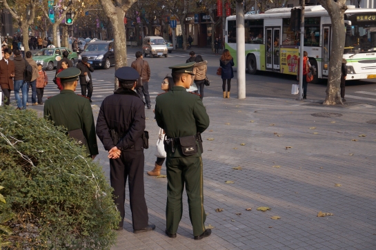
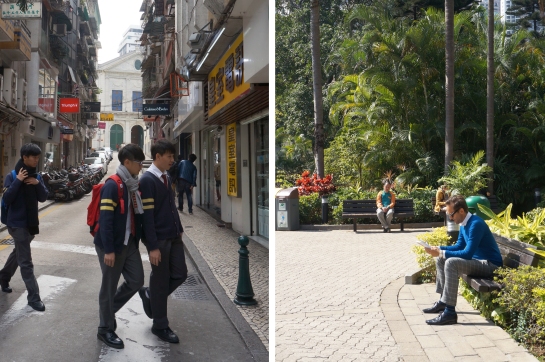
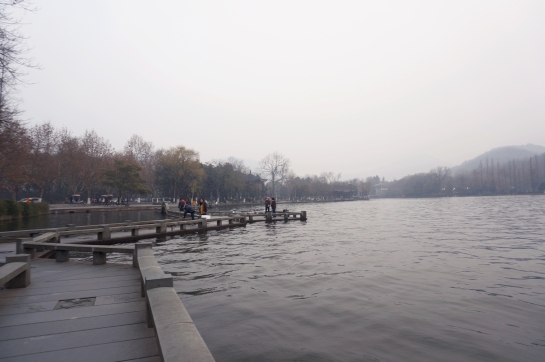
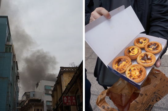
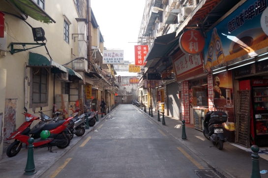
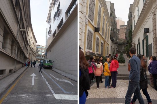
Ages ago – January to be exact – when most of my friends were celebrating the start of 2014, I was on my first flight out of the country since 2011. The first few days were spent in Shanghai and some of its surrounding towns – a confusing journey in which the tour guide only spoke Mandarin and Cantonese, neither of which are languages I am fluent in – before settling in 香港/Hong Kong for a bulk of the trip. To settle makes it sound as if I was in Hong Kong for an extended period of time, when it was only the better part of nine days, but I remember it all as some dizzying adventure, the same ilk of The Grand Tours during the 1800s. Alas, I was not European nobility, nor roaming the streets of Europe, but instead a college student poking her head into side streets and tasting food I hadn’t eaten since I was a small child.

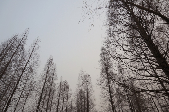
Looking back, it seems like there were too many and yet not enough photographs taken, leading to the severe edit of images you see here. ‘Authentic’ egg tarts, check. Architecture, check. Photos of self…well, maybe not so many of those. At some point though, now when I think of Asia, photographs just don’t do it for me anymore. I think of the smog in Shanghai and the pleasant weather in Hong Kong (although according to Sam, we’ll see what I think about Hong Kong once I experience a HK summer.) Hong Kong remains especially memorable for me – I got to finally meet Sam and Tania, the duo behind A Boy Named Sue, and also hang out with my friend Rachel, who I haven’t seen since I left Australia.

To sum up: over the course of eighteen days, I fell a little bit in love with Asia, fell a lot in love with Hong Kong, and rekindled a need to travel. My only regret is that I didn’t get to explore more of the art and street culture at either place, but things to consider the next time I go overseas.
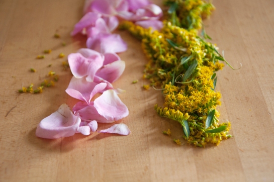
cropped flowers

Happy belated mid-autumn moon festival! I hope everyone had a lovely time with their family (if you celebrate) and ate lots of moon cakes– those have always been one of my favourite things to eat at this time every year. Because of my coursework, I wasn’t able to return home for it this year, but I’ll make sure to get my moon cakes somehow.

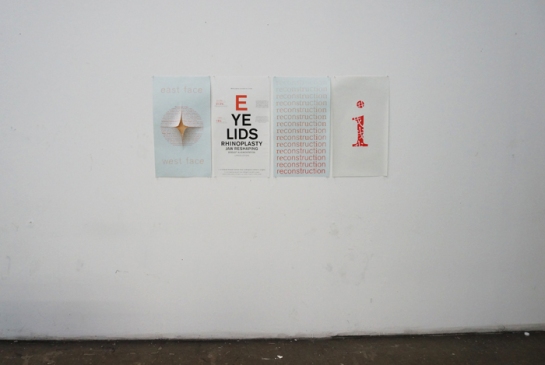
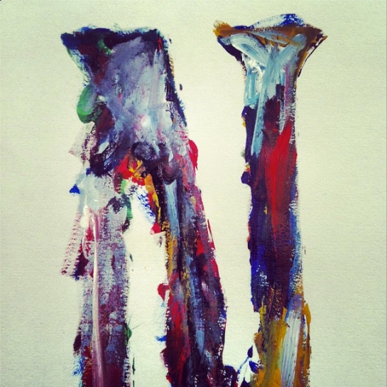
Aside from a spot of dreadful humidity last Wednesday, September has been such a lovely month– there’s been all the excitement in the air from being back at school, from Fashion Week, from getting to see the ol’chums that slid out of your life during those warm summer months. I’ve been spending a lot of time researching for various studio assignments, one direction leading towards a coming of age, the other directed by my fondness for art history. I’m not completely sure where I’m headed with either of those concepts, but they’re getting there, hence my hybrid of flowers and the random assortment of Instagram updates.

And so, here’s a quick hello before I turn in for the night, before I resume my self-induced studying…on Sunday. I’m going to the NY Art Book Fair tomorrow at MoMa PS. 1 which, if last year was any indication, seems the most of promising ways to begin the last wind down of such weather that sticks to the back of your neck as ice coffees give way to pumpkin spice lattes.


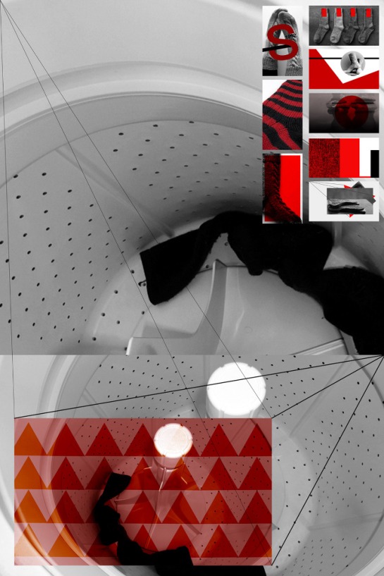
final poster 2

(Poster, 24″ x 36″)

Virginia Postrel writes that “[today’s aesthetic profusion]–the choice of thirty-five thousand colours of plastic, fifteen hundred drawer pulls, thirty thousand fonts, motifs from nearly every culture that has never existed–serves a variety of tastes and circumstances. And all those choices allow ever more specific signals of identity and affiliation.”

With this quote in mind, my professor set us on our way towards a five week, often trying, adventure about developing our digital literacy by becoming familiar with notable historical movements in design and learning how they’re represented visually. To note, this happened back in October, but since I never ended up putting it up, I’m still eager to share it!

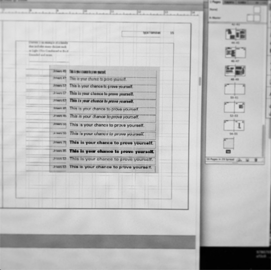
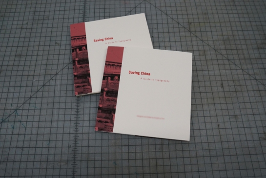
All of us were randomly assigned three different styles (I had new typography, baroque, and navajo/southwestern) along with being tasked to choose an object that represented us. Without going into specifics, my self-referential item was a pair of socks. Using those three styles we were to create 54 portraits of our object and include both a poster that displayed our best 9 portraits and a process book that had a title page and table of contents.

When it came down the poster, I really wanted to make something simple, that spoke to the styles I had without it becoming a fight between the filter tool and my hand. So keeping my colour palette minimal and choosing portraits that shared similar qualities felt like the right direction to take and from there I eventually made the poster above. Ten months down the road and I’m not sure if all of the background information (the styles, the portraits, the “aesthetic profusion”) holds up, but the result is something I’m still keen about.