
(Hybrid of photos from camera and Instagram.)
Sorry Mom, I didn’t mean to be a designer.
(Hybrid of photos from camera and Instagram.)
Sorry Mom, I didn’t mean to be a designer.

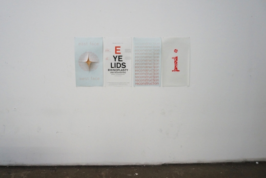
(Poster, 24″ x 36″)
Virginia Postrel writes that “[today’s aesthetic profusion]–the choice of thirty-five thousand colours of plastic, fifteen hundred drawer pulls, thirty thousand fonts, motifs from nearly every culture that has never existed–serves a variety of tastes and circumstances. And all those choices allow ever more specific signals of identity and affiliation.”
With this quote in mind, my professor set us on our way towards a five week, often trying, adventure about developing our digital literacy by becoming familiar with notable historical movements in design and learning how they’re represented visually. To note, this happened back in October, but since I never ended up putting it up, I’m still eager to share it!
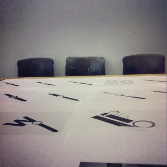
All of us were randomly assigned three different styles (I had new typography, baroque, and navajo/southwestern) along with being tasked to choose an object that represented us. Without going into specifics, my self-referential item was a pair of socks. Using those three styles we were to create 54 portraits of our object and include both a poster that displayed our best 9 portraits and a process book that had a title page and table of contents.
When it came down the poster, I really wanted to make something simple, that spoke to the styles I had without it becoming a fight between the filter tool and my hand. So keeping my colour palette minimal and choosing portraits that shared similar qualities felt like the right direction to take and from there I eventually made the poster above. Ten months down the road and I’m not sure if all of the background information (the styles, the portraits, the “aesthetic profusion”) holds up, but the result is something I’m still keen about.

It’s been awhile since I’ve posted anything related to what I’ve made and even longer since I posted a spec preview for the mobile phone interface I was working on last semester. But here, finally I’m sharing it! (Scroll to the bottom if you’re keen on getting straight to it and not so keen on the behind-the-scenes stuff.)
The assignment itself was quite open – we were to come up with a mobile app concept, design the interface for it, and create a promotional clip to accompany the specs. (Including sound was highly encouraged, having text present was required!) My goal was to design an app that would benefit the students at the university I attend and it was clear that an app that would solve a lot of problems and complaints on campus would be a transportation-related one.
Enter Loop.

I tried to make the functions as simple as possible for someone familiar with the how the university’s shuttle bus system works. Ideally, you’d be able to see where the bus is (so you know whether it’s on time or running late), what the schedule is for the day, the route the shuttle bus takes (so you can see which stop is closest to your destination), and the always important plan-your-trip. The home symbol in the upper left would let you change which bus route you planned to take and a personalized log-in would mean that the person symbol on the bottom would link to a copy of your student identification card, just in case.
Ideally, I’d go back into the file and slow down the frames per second even more…but at thirty seconds the lyrics started to come through the speakers, so thirty seconds is how long my promotional clip ended up being. Hope you enjoy!
Driving update: I’ve slowly gotten more comfortable with everything especially reversing, though my actual reversing into a parking space is still quite deplorable. Baby steps, right?
Ever since we learned about brochure folding in one of my studio courses last spring, I’ve caught the bug of looking for unique paper folds or, really, anything that isn’t your standard tri-fold (personally? I really enjoy when a gate fold is employed properly.) So when my mother received this brochure from Disney in the mail, I had to stop her from tossing it in the recycling simply on how different it was from other brochures I’ve collected this summer.

I like how clean it is on the outside– yes, all the text is dead center in each panel, but the different colours and treatment of the text keeps it from being boring. To be honest the brochure uses an accordion fold at its core. Where I like how they’ve treated the accordion fold shows up when you flip it to the other side.


How the brochure looks like on the inside before it’s unfolded – I think it’s quite neat how it looks like three separate blocks of photos, letting it be more than just another standard sunny, palm-tree filled photo of Florida.

Once you open it up, it’s easy to see why I like that extra fold on top of the accordion fold. In a very subtle way the brochure is able to start making its pitch about enjoying the summer sun at this resort without throwing a handful of facts and reasons why in your face, not to mention it helps the inside stay as simple and uncluttered as the outside is. Instead of being merely decorative, the extra fold hides those bits of information until you fully open the brochure – which, when we’re so used to seeing really mundane brochures that shout information at us in our every day life, isn’t a bad thing at all. To be sure, it may not be the most uniquely designed brochure out there (it is a brochure for a resort after all), but it has that element of visual surprise without being fussy.
